Customizing the AEM Grid
Here’s how to adapt the layout container to your custom responsive requirements.

I’ve already reviewed common misconceptions of responsive design in AEM. Based on that, we can look at two approaches that address these fallacies while adhering to AEM grid best practices:
1. AEM grid can be strictly used for the layout container, while any responsive component styling can be done with an outside framework. This is the recommended approach when front-end developers use heavy responsive customization, but want to maintain responsive authoring capabilities. Using a front-end framework outside of AEM tends to be preferred by many front-end development workflows.
2. AEM grid can be used for both responsive authoring and styling components. This is the recommended approach when complex responsive requirements exist, the front-end code base is AEM-dependent, if you are leveraging a single set of responsive grid HTML classes, and/or the requirements of maintaining the AEM grid authoring functionality is well known.
Despite which approach is used, the responsive authoring experience may not match the responsive criteria defined in the style guide, and customization will be required. The AEM grid has its own set of breakpoints, and the responsive authoring must reflect the same breakpoints the styled components are using. Additionally, make sure to maintain the original integrity of the responsive authoring capabilities to ensure there aren’t potential issues in the future.
Bootstrap continues to be a popular framework in front-end development, and many people ask how the AEM grid can adapt to play nicely with this particular responsive grid. This walk-through will show you how to update the AEM grid CSS to match Bootstrap Version 4’s responsive definitions, while maintaining the responsive authoring functionality of the layout container.
The first step is to modify the AEM grid style sheet to match the Bootstrap breakpoints.
Out of the box, the AEM grid uses three breakpoints for a 12-column grid. The media queries follow a “desktop first” approach using a default breakpoint, a phone breakpoint that spans the smallest size to a maximum width of 768px, and a tablet breakpoint that spans a minimum width of 769px to a maximum width of 1200px. These media query values will need to be updated in the grid.less file provided in AEM. If using the AEM project Archetype, this file is located under ui.apps/src/main/content/jcr_root/apps/{client-name}/clientlibs/clientlib-site/less/grid.less
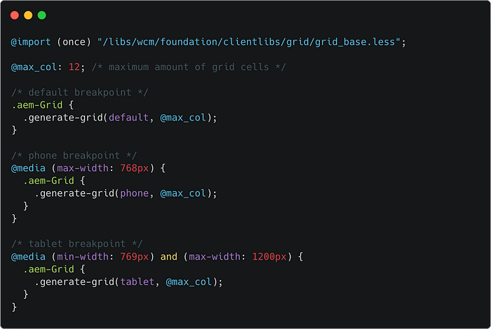
grid.less file that generates the AEM grid classes used by the layout container.Keep in mind, the original responsive authoring capabilities will need to stay intact, and to do so, the breakpoints will need to be defined as independent of one another. Why is this the case? If the media queries follow only a minimum or maximum value, as authors are modifying the responsive behavior in Layout Mode, those changes may “bleed over” into other breakpoints, and edits will be difficult to track. Content authors can have full control over how the responsive behavior functions by maintaining the ability to manually configure components for each individual breakpoint size.
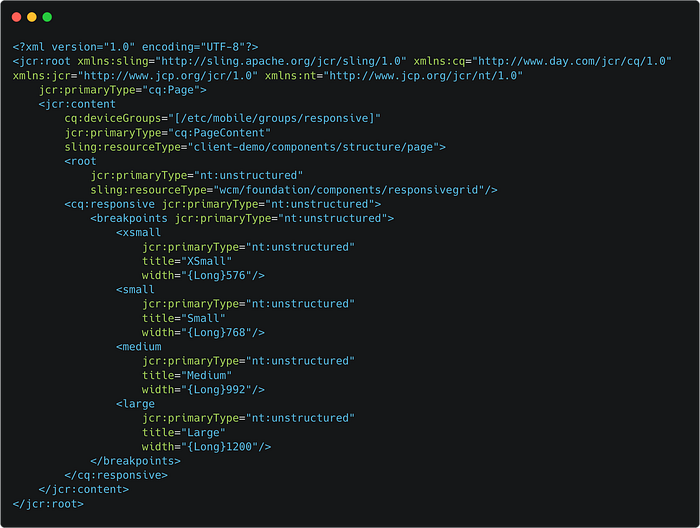
So in order to do this, we’ll look at the breakpoints that Bootstrap provides OOTB…
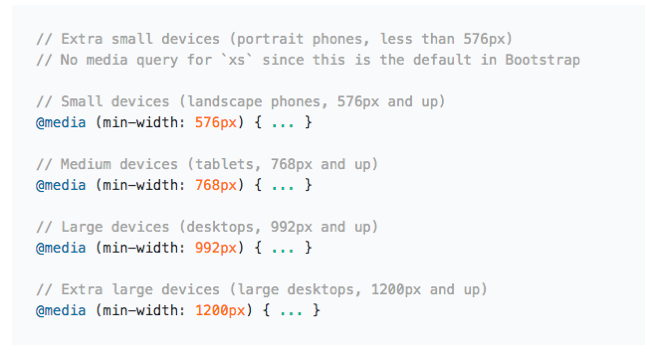
Bootstrap also provides an example that shows targeting a single segment of screen sizes using minimum and maximum breakpoint widths. This is the approach that needs to be used for updating the AEM grid CSS…
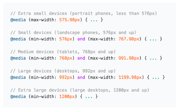
These Bootstrap values will guide how to edit the grid.less file. The output should look something similar to the code sample below…
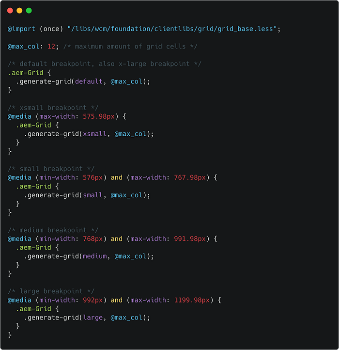
Take notice that the HTML classes did NOT change, as this would break the Layout Container functionality. The @max_col: 12; value is also maintained as Bootstrap also leverages a 12-column grid.
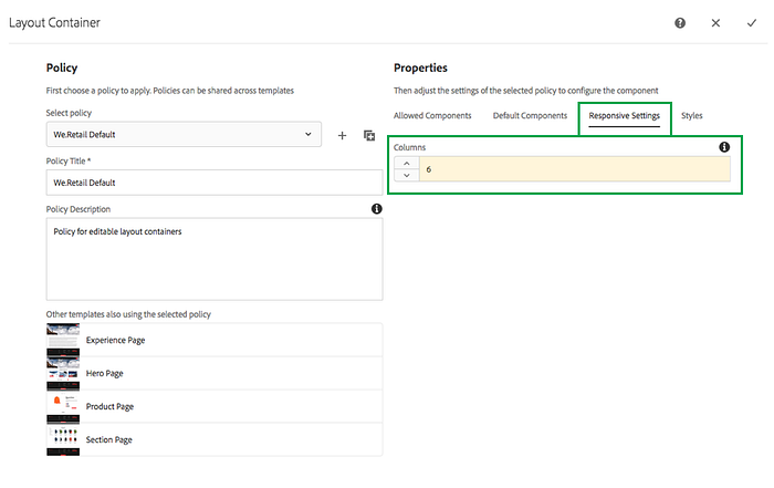
If the style guide responsive criteria references a different number of columns (other than 12), this will will need to be changed at the CSS level AND at the Layout Container policy for the template.
This is just an example of updates that can be made to the AEM grid to reflect the values that Bootstrap uses. These same principles can be applied using your own custom responsive breakpoints.
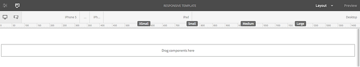
The second step is to make sure the Layout Mode for content authors accurately reflects the new breakpoints.
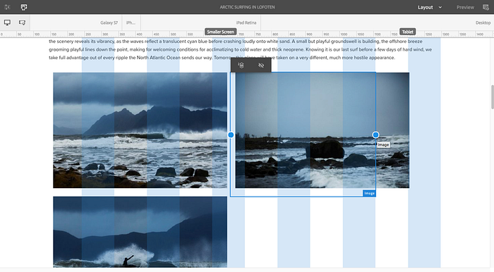
Page authors have a reference point for the AEM grid breakpoints through the breakpoint markers displayed in Layout Mode at the top of the page. These labels will need to be updated to reflect the new Bootstrap breakpoints.

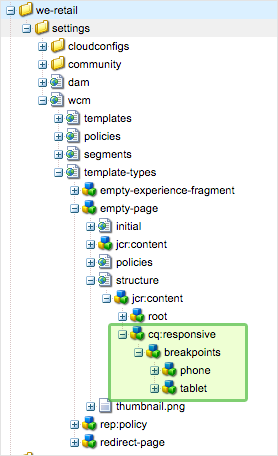
In order to update these breakpoint markers, the nodes in the structure definition for the template will need to be updated:
IMPORTANT NOTE: Since these changes need to be reflected in all of the templates, it is a best practice to update the Template Type. It is highly recommended to define the responsive grid strategy at the start of development work. If changes are made to the template type after templates and pages have already been created, the layout mode won’t reflect these updates.
The corresponding nodes in the structure definition of our template type will need to be modified:
If using the AEM Project Archetype, the Empty Page template type can be found at ui.content/src/main/content/jcr_root/conf/{client-name}/settings/wcm/template-types/empty-page/structure
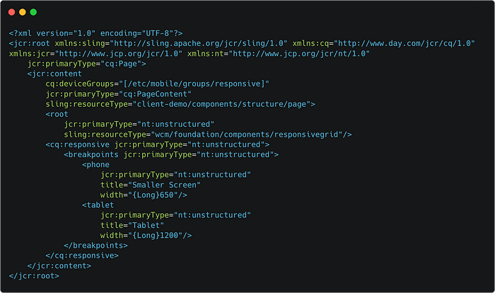
These nodes will be replaced with the new nodes for each corresponding Bootstrap breakpoint, including the label name for Layout Mode, and the responsive max-width value.
Modifying the template type is considered a developer activity. The template type should be committed to source control and deployed with the AEM project. After this code change is made and deployed, the content author can then create new templates based on the updated template type.
As discussed earlier, modifications to the template type are not “live,” meaning that existing templates will not automatically inherit updated breakpoint definitions. For this reason, it is considered a best practice to define the responsive strategy early in the development process.
Next time the content authors create a template from this template type, it will inherit the newly defined responsive breakpoints.
Responsive authoring is a powerful tool for content authors to take advantage of the tailoring the full experience. While there may be a few nuances to consider, the responsive criteria can easily be customized in a way that tailors to a range of responsive style guide needs while maintaining the original integrity of the layout container component.
KEY TAKEAWAYS:
- When customizing the AEM grid, it’s imperative to maintain authoring capability with independent breakpoints.
- If changes are made to the breakpoint values for the AEM grid CSS, it is helpful to update the corresponding breakpoint markers in Layout Mode so your content authors understand the changes.
- Defining responsive criteria up front will prevent running into syncing issues down the road when additional pages and templates are created.
A big thank you to Bryan Stopp and Daniel Gordon for their technical expertise and feedback in putting this together!


