Image Cropping & Layout Behavior Test – 2000× 938
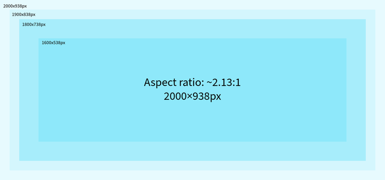
From initial observation, images across Featured Articles and Top Stories were being cropped inconsistently. The same image behaves differently depending on container orientation and breakpoint.To evaluate high-resolution images for improved rendering and reduced cropping impact
Image Details:
- Resolution: 2000 × 938 px
- Aspect Ratio: ~2.13:1
- Type: High-resolution (optimized for large screens)
- Usage: Featured Article, Top Stories, All Articles
Why this test :
From initial observation, images across Featured Articles and Top Stories were being cropped inconsistently. The same image behaves differently depending on container orientation and breakpoint.
Rather than treating this as a one-off issue, the intention was to:
- Identify a standard aspect ratio
- Validate behavior across responsive layouts
- Define a safe-area guideline for content creators
How the testing was done
To validate behavior accurately, multiple controlled tests were performed:
- Used same image across all components (Featured, Top Stories, All Articles)
- Created test images with clear subject positioning
- Verified behavior across: Desktop, Tablet, Mobile
- Applied object-fit : cover to simulate production behavior
- Compared results with existing implementations from : Adobe Developer Blog, Main Adobe Blog
Additionally, bordered and visually marked images were used during testing to clearly identify cropping areas and container boundaries.
Testing Observations
1. Featured Article
- Image renders cleanly across all breakpoints
- High resolution improves clarity and sharpness, especially on large screens
- Cropping still occurs due to responsive container resizing
- However, cropping is less noticeable compared to lower resolutions
Conclusion:
High-resolution images (2000×938) significantly improve visual quality while maintaining consistent behavior.
Experiment: Width Adjustment
A small local experiment was performed:
- Slightly increased image width
- Maintained centered composition
Result:
- Cropping appeared less aggressive
- Visual balance improved
Trade-off:
- Breaks consistency with fixed layout system
Safe Area Recommendation
To ensure consistent results across all components:
- Keep important content within center ~60% of the image
- Avoid placing: Faces, Text, Key visuals, near edges
This ensures visibility even when cropping occurs in Top Stories and smaller breakpoints.
Final Takeaways
- 2000 × 938 (~2.13:1) is a strong candidate for standardization
- Better clarity
- Improved responsiveness
- Consistent rendering across devices
- Cropping is not an issue to eliminate, but to manage with safe-area design
Where this leads next
Based on this testing:
- Standardizing aspect ratio across components can improve consistency
- Alternative components (landscape-friendly) can be explored for Top Stories
- A future improvement could include: Supporting multiple images per article (landscape + portrait)