Mapping Your Way Through Application Security Obstacles
Author: Peleus Uhley, Principal Scientist & Lead Security Strategist

As a security researcher, it is always important to stay current and explore new technologies. Graph databases have been around for a while, but I never had a use case to dive into them until recently. This blog series will cover what I learned from a recent exploration of how they can be leveraged for application security within large organizations.
John Lambert, Distinguished Engineer, Microsoft Threat Intelligence Center, is often quoted for saying, “Defenders think in lists. Attackers think in graphs. As long as this is true, attackers win.” This was one of the concepts that had originally hooked me on the idea of exploring graphs in our tooling. There have been many examples of graph databases used to solve problems in network security, spam and fraud detection, along with cloud configuration issues. These include open source tools such as Bloodhound AD, Grapl, and CloudMapper. There are also non-security use cases found within the developer world such as New Relic’s, “Service Maps”. Graphs have even been argued as a necessary component to move machine learning to the next level. However, there are not many examples specific to web application security.
Graphs have proven useful to desktop application security for many years. Reverse engineers rely heavily on the visual call graph that tools like IDA Pro provide in order to understand the flow of the application. For web services, the closest example is that application security researchers have relied on service diagrams at the top of every threat model. The challenge is that these static, threat model diagrams are limited both in detail and keeping up with changing architectures. When threat modeling first began, architecture diagrams had a clear linear flow and often looked like this:
Today, micro-services have created hub-and-spoke models of multiple inputs and outputs. For large micro-service organizations, the network diagrams now look like this:

Different sources have quoted Netflix as having approximately 500–700 micro-services powering their company. This exceeds what humans can reasonably track manually with simple static diagrams.
Therefore, in order to track data through a complex system, we need more than static pictures of the conceptual representation of the service. We need the ability to dynamically interact with the graph through code. As John Lambert said in his blog, “Defenders should take a lesson from how attackers come to understand the graph. Attackers study the infrastructure as it is-not as an inaccurate mental model, viewed from an incomplete asset inventory system, or a dated network diagram. Manage from reality because that’s the prepared Defenders Mindset.” In the world of micro-services, the risk that an application diagram quickly becomes dated is significant.
Not only it is necessary to have a dynamic graph of the application flow that can be queried via code, it is also important to relate the meta information about the application that is distributed across different sources. If you work with a small team, this may not be complicated because there is one source repo and one production environment. You can take advantage of commercial products that can link static and dynamic analysis in these simplified environments.
Working within a large company, you will have hundreds of services, written in dozens of languages, and distributed across different cloud providers plus traditional data centers and CDNs. There is no single vendor tool that handles that complexity. The ability to identify an issue in source code, determine whether it is in production, and scan its environment all via code within a scalable infrastructure is critical. In order to accomplish that goal, organizations need to be able to programmatically link each team with their GitHub location, domain name, Jira queue, security tools, etc. in addition, to dynamically represent how the services are connected to better understand data flow.
By collecting the metadata, organizations can both map the data flow and make it more robust. A traditional application dataflow diagram will simply show a box labeled with the name of the component. An enhanced data flow diagram could make it possible to see its GitHub location, the security tools tracking it, and other relevant information. This can make working with a development team much more efficient.
To make this possible, organizations need to ingest information from multiple sources into one database. This style of approach was previously in the Marinus project where domain information was pulled from multiple sources and correlated in a Mongo database. SQL databases tend to be more difficult to use when correlating data from disparate sources since there is no shared primary key. For this graph project, MongoDB could only be used as a temporary cache for the data since MongoDB is mostly designed to store data as independent records. Organizations should know how and why the data relates. Using table joins within an SQL database to relate the data assumes a consistent method of connecting the information. Since each team will have their data stored across a different subset of tools, there is no guarantee that the way in which the data is connected will be consistent.
This is where graph databases become the preferred approach. With graphs, data can be connected for any reason, between any two vertices, for whatever reason you deem appropriate for those two vertices. When performing a query, you can ask whether two pieces of information are related regardless of the reason why they are related or how many degrees of separation exist between the two pieces of information. Graph databases provide a flexible way to search across complex relationships.
Even in the very early stages of the project, mappings were created with only a small amount of code. Below is a screenshot from the first prototyping of the tool. This diagram does not show the data flow between services. However, this diagram from the initial prototype does show the ability to connect metadata information from many different sources into a single, linked representation. This tool first ingested data from a dozen different, disparate sources within the company and stored it in the graph. Next, the tool was able to identify that at least four of those systems had information for the service that I queried, and was able to produce a graph that linked together the metadata data for that service:
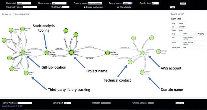
Within this graph, organizations can now tie together the service name, GitHub location, AWS account, domain name, and contact information. This information alone is enough to allow us to complete the flow between finding a static analysis issue, testing for the issue on the domain where it is deployed, and filing an issue if the service is vulnerable. Most importantly, this can be done via code without any contextual knowledge of the service. This tool allows testing at scale across a wide range of services without pre-configuring data for each one.
Graphs aren’t the right tool for every problem, but they can be a valuable tool. In future blogs, we will discuss the technology stack that used to build this project and the lessons that were learned while building it. We will also provide more complex examples of the different ways in which data can be linked together for different goals.