What You Should Know About Variable Typography
Authors: Agnieszka Naplocha & Jan Lipiński.

OpenType variable fonts (CEF 62) are now available in Creative Cloud prereleases. If you’re ready to experiment with variable fonts and saving space in your extension or plugin, join a prerelease and give variable fonts a try.
— Erin Finnegan, Sr Community Engineer, Creative Cloud Ecosystem
What are Variable Fonts? Why do we need them? Why is it such fun to experiment with them? Let’s find out more about this topic, exploring both design and technical details connected with typography on the web.
Why should we care about typography?
Good typography is invisible. While reading we don’t consciously pay attention to it. The situation changes when there are some typographic problems with the text presented on the web or in print; we immediately feel that something is wrong. Although many of us are not familiar with the rules of typography, it’s relatively easy to recognize when the reading process is not smooth.
Typography has a big impact on the reading experience. Plus it gives character to our brand. Hence, typography is both practical and eye-pleasing.
Something new is coming
Web has been changed through the years and typography has been enhanced as well. The 21st century approach to typography brings a lot of excitement to the design and tech world. The main highlight is variable fonts.
Although variable fonts are still in experimental mode to some extent, it doesn’t mean we can’t use them or explore this notion for our own purposes. We’d rather encourage all of you to try them out and implement them as soon as possible.
Why is it so exciting? Variable fonts offer totally new, enriched experiences with digital typography. First, we can be more creative, and at the same time we can influence important issues on the web such as performance and accessibility.
One file and endless possibilities
What is a variable font? Let’s Imagine a situation in which we have a typeface with various styles: bold italic, light italic, semi-bold, regular etc. To use a particular style, we need to load a certain file. If we implement all of them, we have quite vast collections of font files.
In variable typography there’s a totally new approach — we have only one file that includes all the other styles. Thanks to interpolation we can access the entire range of weights, widths, and styles available, rather than being constrained to only a few that we need to load separately.

If we compare file sizes, we see a huge difference. In total, we can save approximately 60% on space (depending on the typeface). It has a definite impact on performance of the website. Additionally, there are fewer HTTP requests, and we can be more flexible in adding new styles. We’re no longer limited by performance issues with loading more than a couple of typefaces. We finally have typographic and design freedom!
We finally have typographic and design freedom!
Remember: A variable font is one file merging all the styles created thanks to interpolation.
Font loading
Let’s dive into the topic. To understand the performance problem, we must first understand how fonts are loaded and rendered on the web. Recently, Google Fonts launched font-display swap for their fonts; you can control the method of loading a font using this property.
font-display: swap;“Swap” means that the text is shown immediately in the fallback font until the custom font loads, then it’s swapped with the custom font. What you get is called a FOUT (flash of unstyled text).
Here’s an example with slow internet connections (you can simulate slower connections by switching on “Throttling the Network” in Chrome DevTools) . In the gif below you can see FOUT and how fonts are being changed.
There’s another value for font-display:
font-display: block;Thanks to this property the text is blocked: It’s invisible for a short period. In this situation the font loading technique is called FOIT (a flash of invisible text).
One interesting case was presented by Zach Leatherman on the conference performance.now. From the example presented in his talk, we can conclude that Mitt Romney actually didn’t run for president.
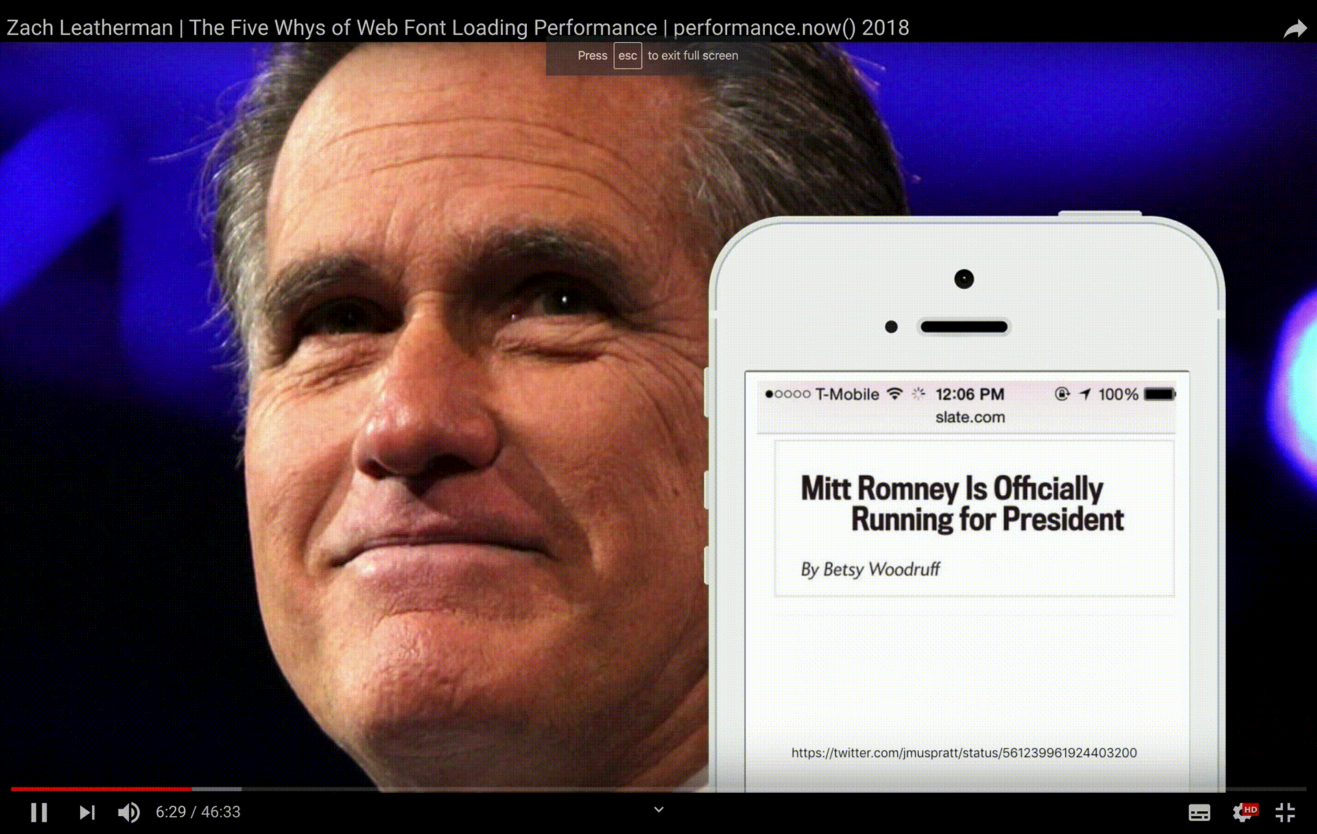
The word “not” was shown to the user after a short delay, demonstrated in the gif above.
How did they do it? The website uses two styles of the typeface in the title; regular and italic. Because the italic font is not yet loaded, the text is invisible, so you see blank space. As you can see, this changes the meaning of the sentence. It proves how important the technique of font loading can be.
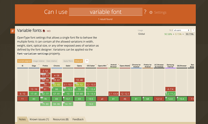
Browsers like variable fonts
The good news is that we don’t have excuses for not using variable font technology, because most browsers support it. There are some exceptions, but as more buzz around it builds and engineering teams experiment, the more the teams behind the browsers become eager to ship it.
The heart of variable font–axes
The heart of the new variable fonts format is the concept of an axis. Each axis describes the range of that particular aspect or feature of the typeface design. It can be weight or width, or any other axes you decide to create as a designer, simply by using a four-letter tag.
There are already five common registered axis tags: weight wght, width wdth, optical size opsz, italic ital, and slant slnt.
This is what the CSS property looks like:
font-variation-settings: 'wght' 37;Custom axes are limitless: the typeface designer can define and scope any axis they like, and are just required to give it a four-letter tag to identify it within the font file format itself. You can use these four-letter tags in CSS to specify a point along that axis of variation, as will be shown in the code examples below.
Here we have a new axis — GRAD:
font-variation-settings: 'wght' 375, 'GRAD' 88;Animations
To understand animations with variable fonts let’s start from describing how you can see different weights of glyphs. Obviously, the well known CSS property font-weightcomes in handy:
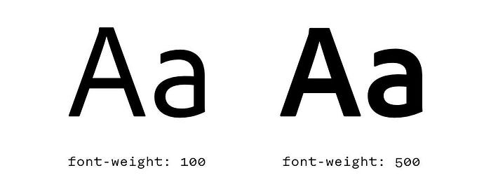
Value 100 displays a lighter glyph and 500 displays a heavier variant of the glyph. Such values are chosen in the @font-face rules while importing font files. Statement font-weight: 100 refers to one file (for example: adobe-clean-light.woff), and font-weight: 500 to another (for example: adobe-clean-bold.woff).
@font-face {
 font-family: ‘Adobe Clean’;
 src: url(‘Adobe-Clean-webfont.eot’);
 font-weight: 100;
}
@font-face {
 font-family: ‘Adobe Clean’;
 src: url(‘Adobe-Clean-Bold-webfont.eot’);
 font-weight: 500;
}
In traditional fonts there are independent, separate files containing all the glyphs in the same variant (light, italic, bold italic etc.). By switching the default CSS style font-style: normal with font-style: italic, in fact, we are changing font files we are referring to. In variable fonts one file contains all variants. And this is huge.
Variable fonts make use of the fact that all glyph shapes are described by Bézier curves, and the curve points can be easily modified. For example, to show a letter n in normal and bold weight we don’t need to have two separate glyphs (stored in different font files). We can have only one, and because of points’ interpolation we achieve the same effect.

During the design of a typeface you can create an axis (e.g. weight) with its perimeters and use all in-between values in a range. Thanks to that, you can have weight 125, which will be slightly thicker than light (defined as 100), but not as thick as the next 300, considered a regular weight.
Similarly, you can define other shape transformations; the degree of slant, or the font width. CSS definition is typical and intuitive:
font-variation-settings: 'wght' 100, 'wdth' 85;Creating the animations looks like this:
@keyframes size-animation {0% {
      font-variation-settings: 'wght' 100, 'wdth' 80;
   }50%{
      font-variation-settings: 'wght' 400, 'wdth' 120;
   }100% {
      font-variation-settings: 'wght' 600, 'wdth' 160;
   }}

In the example above you can see the weight of the font (wght) as well as the width (wdth). Going one step further you can try more experimental changes. Glyphs in this example are made from many small squares (pixel-like shapes). With a special axis, SHAP (shape), they change the shape of each pixel, building the given glyphs. An animation for this is as simple as the following:
@keyframes pixel-animation {0% {
     font-variation-settings: 'SHAP' 0;
  }100% {
     font-variation-settings: 'SHAP' 100;
  }}

And this is the result of the animation implemented in CSS:

The time is now
To sum it all up, there are two important things which you should remember about Variable Fonts:
- They’re stored in one file, including all the styles.
- The core concept are axes: fives axes are registered and others are called custom axes.
The areas on which Variable Typography has the biggest impact are:
- accessibility; We can change the contrasts in fonts depending on the environment and light intensity.
- art direction
- performance
Variable Fonts bring a lot of new opportunities not only for creativity on the web, but also on performance. The two most obvious benefits are typographic flexibility and reduced file size.
Variable fonts bridge the gap between type designers, web designers, and developers. As web creators we should implement them in our daily work.
Application support
✅ Adobe Illustrator CC 2018 (22.0.0)
✅ Adobe Photoshop CC 2018 (19.0.0)
✅ Adobe InDesign CC 2020 (15.0)+
For more information regarding support check out this website.
Useful websites & resources
For more stories like this, subscribe to our Creative Cloud Developer Newsletter. If you use an RSS feed reader, subscribe to our Adobe Tech Blog Creative Cloud feed.


